Category Archives: Statistics

RIP OFFSTATS

I’m back at work from an extended break only to find that my favourite statistics  portal OFFSTATS is no more 🙁 https://www.library.auckland.ac.nz/about-us/collections/decommissioned-databases

I received an email from them explaining that they no longer have the resourcing available to maintain and develop the database. Also, as much of the content can now be discovered through other approaches they felt the need for this type of search tool was not so relevant as it had been a few years ago.

A shame but understandable from their point of view. It was always a popular resource on my search workshops and often featured in the participants’ “Top Ten Tips”.  It was one of the few resources of this type in which humans assessed and monitored the quality and relevance of the sites listed.  Very sorry to see it go.

Interactive maps of UK renewable energy generation

I recently mentioned Gridwatch (How the UK’s electricity is generated  http://www.rba.co.uk/wordpress/2013/08/21/how-the-uks-electricity-is-generated/) as a way of tracking how much energy is passing through the National Grid and the technology used to generate that electricity. Although Gridwatch is a great way of observing the total amount of electricity that is generated by each technology – gas, coal, wind etc – it does not go into any detail with respect to individual installations. The Digest of UK energy statistics (DUKES) produced by the UK  Department of Energy & Climate Change (http://www.gov.uk/government/organisations/department-of-energy-climate-change/series/digest-of-uk-energy-statistics-dukes) includes a spreadsheet listing all of the operational power stations, fuel that they use, installed capacity, location, and the year that generation began. The direct link to the spreadsheet is http://www.gov.uk/government/uploads/system/uploads/attachment_data/file/226895/dukes5_11.xls. This is historical data and the current list refers to plants in operation at the end of May 2013.

UK Energy Watch has a map (http://www.ukenergywatch.org/Electricity/PowerStations) showing the location of UK power stations of 400 MW or larger, so it is by no means comprehensive. It does allow you, though, to click on a plant and display current generation except for CCGT stations (Combined Cycle Gas Turbine).

There are more options available when it comes to what are called renewables (for example wind, solar, biomass, hydro). The DECC’s RESTATS interactive map at http://restats.decc.gov.uk/app/pub/map/map/ enables you to search by technology, region, county, planning authority and application status. It also has a separate map for wind farm capacities.

RESTATS Interactive Map of Renewables

The site information includes installed capacity, details of the planning application but not how much energy is actually being produced. RESTATS says that “Information is held on the performance of operational projects but owing to the need to maintain the commercially sensitive nature of these data, specific site details and performance figures are not disclosed“.

RestatsSIteDetails


The UK Data explorer has produced a renewables map at http://ukdataexplorer.com/renewables/ that uses the RESTATS data and shows operational renewable electricity sites over 0.01 MW. The different colours represent the type of plant and the area of the circles indicate installed capacity (maximum power output).

UK Data Explorer renewables interactive map


To see details of a specific installation you should be able to hover over a point on the map. This did not work for me with some of the smaller plants and when I tried to zoom in on an area I often lost the background map.

The Interactive Map of Renewable and Alternative Energy Projects in the UK at http://www.renewables-map.co.uk is another interactive map and can be filtered by technology type and planning status.


Renewables Map UK


According to the website the information is gathered from “a wide range of web resources, in all cases these will be referenced, usually by a link to that information. Locations are either taken from existing data, usually from planning applications, or by painstakingly identifying the location on the ground using online maps.” I am not sure how up to date the map is and I noticed that the smaller hydro installations along the Thames are missing. Another problem that I have experienced with this site is that when I click on “More details” for an installation I get far too many “internal sever errors”. However, when the information does appear it includes useful comments on the technology, links to relevant websites and the latest news.


Renewables_Map2

The final one in my list is from the energy generating company RWE Innogy (http://www.rwe.com/web/cms/en/194914/rwe-innogy/sites/production-data-live/). Its interactive map provides information on most of its European plants and includes wind farms, hydro power plants and biomass CHP (Combined Heat and Power). The production data is updated every minute. To see information on an installation, click on its icon on the map. The information includes live production, location, type of installation and when production started.

 Renewables_RWE

These are by no means the only websites offering interactive maps and information on UK energy production, and none of them give the full picture. They are good starting points, though, if you are interested in researching individual technologies or individual power stations.

Statista: statistics, industry and market data

Statista (http://www.statista.com/) is a portal for statistics, market data, market research and survey results. It aggregates data on over 600 international industries from more than 18,000 sources, including market researchers, trade organizations, scientific journals, and government databases. You can get a rough idea of what the service covers from the list of topics at http://www.statista.com/topics/, although this does give the impression that it is heavily US biased, which is not the case.

Searching Statista is straightforward. The default is to include what it calls word fragments, so a search on the term bank will also find banking. This can be changed to identical words if you require an exact match. To search for phrases place double quote marks around your terms, and documents containing a specific term can be excluded by prefixing the word with an exclamation mark. You can ‘OR’ terms by inserting the vertical bar symbol (|) between them, for example dog | cat. To refine your search further use the options on the right hand side of the results page. These include date of publication, region, free/fee-based/all, and category.

Trying to view the data and charts that you find can be a frustrating process as most of the information is only available on subscription. There is a limited amount of free information but you still have to register for what Statista calls its basic free access. The premium account for an individual user is USD 49/month and runs for a minimum of 12 months. This is automatically renewed so make sure you cancel before the year is up if you no longer wish to use it. The corporate subscription is USD 199.90/month. Again the subscription runs for 12 months. A free trial is available for the corporate service but not for individual users. Prices for universities, libraries and education are available on request.

On the results page you can easily identify the subscription content by the red plus sign next to the chart icon to the left of the result. A red ‘P’ indicates a priced report that is free to corporate clients but can be purchased by basic and premium account holders.

Statista Results Page

Clicking on a result takes you to a page where the data is displayed as a chart or graph depending on what Statista thinks is the most appropriate for that statistic, but you can change the representation if you wish. There are also options for downloading the data in various formats and links to the original source.

Statista chart and download options

Information is provided on the source and includes title of the original document, the publisher, publication date, time period covered by the survey and the geographical regions covered. Statista also adds notes such as definitions of terms used in the original report and observations on possible missing data.

Statista metadata and report information

Much of the information on Statista can be found by via Google or Bing using advanced search commands and options, but you will probably have to wade through a significant amount of irrelevant information before you find the data you need. Statista can certainly save you a considerable amount of time, and the data displays are a great way of helping you identify the potential usefulness of a report, as can the metadata and notes.

Is the subscription worth it? It is definitely cost effective for corporates in terms of saving search time and ensuring accuracy and quality of information. I have had good feedback about Statista from several of my clients. I am not so sure about individual users. Some of my own research is highly specialised and I am not convinced that Statista covers all of the areas of interest to me. It is difficult for me to assess its value without trialing the full service first, and there are no pay as you go options such as a day or weekly rate. I might even consider paying for a month’s access for a project but it is a full year’s subscription or nothing. Nevertheless, I recommend you take a serious look at it and if you are contemplating a corporate subscription you can ask for a free trial. It is now on my list of essential research tools.

Top Tips from SWAMP

Swansea_20130624_400
View from Swansea Central Library

Towards the end of June I headed off to Swansea Central Library to facilitate a workshop on search tools and techniques for finding business information and statistics. The session was organised for the libraries of the wonderfully named SWAMP – South West and Mid Wales Partnership.

We had fantastic views from the library of the sea and shore line so they did very well to remain focused on the work in hand. The top tips that the group suggested at the end of the day were a mixture of search techniques and business information sites.

1. Persistence.
Don’t give up and don’t get stuck in a rut. If your first attempts fail to produce anything useful try a different approach to your search. Try some of the tips mentioned below: use advanced search commands, a different search tool or go direct to a website that covers your subject area or type of information.

 2. Verbatim.
Google automatically looks for variations on your search terms and sometimes drops terms from your search without telling or asking you. To beat Google into submission and make it run your search exactly as you have typed it in, click on ‘Search tools’ in the menu above your results, then click on the arrow next to ‘All results’ and from the drop down menu select Verbatim.

3. Private Browsing.
To stop search engines personalising your results according to your previous searches and browsing behaviour, find out where the private browsing option is in your browser (in Chrome it is called Incognito). This ignores all cookies and past search history and is as close as you can get to unfiltered results.

Short cuts to private browsing in the main browsers are:

Chrome – Ctrl+Shift+N

FireFox – Ctrl+Shift+P

Internet Explorer – Ctrl+Shift+P

Opera – Ctrl+Shift+N

Safari – click on Safari next to the Apple symbol in the menu bar, select Private Browsing and then click on OK.

4. The site: command.
Include the site: command in your search to focus your search on particular types of site, for example site:ac.uk, or to search inside a large rambling site. You can also use -site: to exclude sites from your search. For example, if you are searching for information on Wales and Australian websites mentioning New South Wales keep coming up include -site:au in your search.

5. The filetype: command.
Use the filetype: command to limit your research to PowerPoint for presentations, spreadsheets for data and statistics or PDF for research papers and industry/government reports. Note that in Google filetype:ppt and filetype:xls will not pick up the newer .pptx and xlsx formats so you will need to incorporate both into your strategy, for example filetype:ppt OR filetype:pptx, or run separate searches for each one. In Bing.com, though, filetype:pptx will pick up both .ppt and .pptx files.

6. Guardian Data Store (http://www.guardian.co.uk/data/)
For datasets and visualisations relating to stories in the news. This is proving to be a very popular site on both the public and in-house workshops. As well as the graphs and interactive maps the source of the data is always given and there are links to the original datasets that are used in the articles.

7. Company Check (http://www.companycheck.co.uk/)
Company Check repackages Companies House data and provides 5 years of figures and graphs for Cash at Bank, Net Worth, Total Liabilities and Total Current Liabilities free of charge. It also  lists the directors of a company. Click on a director’s name and you can view other current and past directorships for that person.

8. BL BIPC industry Guides
The British Library Business Information and IP Centre’s industry guides at  http://www.bl.uk/bipc/dbandpubs/Industry%20guides/industry.html highlight relevant industry directories, databases, publications and web sites. Excellent starting points if you are new to the sector.

9. Web archives for documents, pages and sites that are no longer “live”.
Most people know about the Internet Archive’s Wayback Machine at http://www.archive.org/and its collection of snapshots of websites taken over the years. There is also a collection of old UK government webpages at http://www.nationalarchives.gov.uk/webarchive/, and the British Library has a UK web archive at http://www.webarchive.org.uk/ukwa/.

10. Keep up to date
Keep up to date with what the search engines are up to, changes to key resources and new sites. Identify blogs and commentators that are relevant to your research interests and subject areas and follow them using RSS or email alerts.

Zanran – great for data in tables, charts and graphs

I regularly mention Zanran (http://www.zanran.com/) in my workshops on search and business information, and it often finds its way into the Top Tips compiled by the delegates at the end of the day.

Zanran is not a Google alternative. Rather than search the text of web pages it extracts and indexes numerical data presented as tables, charts and images in PDF reports, spreadsheets and ordinary web pages. You can simply type in your search terms but there are additional options for narrowing down the search by location of the web server, specifying an individual site, selecting a time period and limiting by file type.

The results page lists the files it has found with an extract highlighting the content containing your terms. In this example I am looking for data on agricultural methane emissions in the UK.

Zanran search results

To the left of each entry is a thumbnail. Moving the cursor over the thumbnail brings up a preview of the page containing the relevant chart, table or image. This enables you to immediately assess the relevance of the data without having to download and go through a lengthy document.

Zanran document preview

If you click on the thumbnail or the title to view the whole document you have to register (free of charge) as copies of the indexed documents are stored by Zanran. If you prefer to go to the original document click on the URL button attached to the summary of the page and click on the link that is then revealed. Unfortunately, you may see “page not found” especially if it is on a UK government department web site. Many of these have now been closed and their content archived making it difficult to track them down. Registering with Zanran is by far the easier option. Also, rather than deluge you with documents from a single site, as Google all too often does, Zanran gives you a link telling you if and how many other results are available on a site.

How does it compare with Google? Well, Google did come up with relevant results for my search but I had to spend a lot of time ploughing through them to identify the best documents. And Google did not pull up in the first 100 results the very useful archived UK government documents that Zanran gave me.

Google v Zanran

If you are looking for data or statistics Google still does a very good job but I recommend you also run a  search in Zanran. It may well come up with a real gem, as it often has for me.


EU launches public beta of its open data portal

The EU has launched a public beta of its new open data portal at http://open-data.europa.eu/open-data/. Open data is information that can be freely used, re-used and redistributed by anyone. The EU portal covers all the information that public bodies in the European Union produce, collect or pay for. At present it has 5,811 datasets of which 5,634 come from Eurostat, the statistical office of the EU.

You can search the datasets by keyword and refine your results using the keywords and publishers listed on the right of the screen.

Alternatively there are options for browsing the datasets using tags and keywords. This may be easier if you are not sure of what terms to use.

Using the tags also seems to be more reliable. A search on coal production gave me one relevant dataset but the rest of the results only had production as a keyword. I was seeing sets for carrot production, production of butter, sunflower production etc. I assume that ‘coal’ had been dropped because there were so few results containing both terms. Searching on just coal reduced the number of results from around 5000 to 7, one of which was highly relevant (Primary production of coal and lignite). The other 6 covered energy production in general including coal. Browsing and narrowing down the sets using the tags does seem to be the best way of navigating the data at the moment.

Once you have identified a relevant dataset additional information such as time span and date last modified are provided together with links for downloading the data.

It’s then up to you to find a way of viewing and analysing the data!

New StatsWales to be launched

StatsWales is the key website to visit for statistics on Wales. A new version of the site, StatsWales ‘Beta’, has been launched with a full launch planned for Monday 3rd December.

New features include:

  • improved search capability
  • enhanced charting
  • direct URI access to data catalogue and reports
  • better sharing of reports including those personally tailored/configured
  • additional direct data access formats
  • more powerful personalisation
  • support for legacy links

The old platform will be available until December 31st

While data is being transferred to the new system access to both the new and the old services will be provided as follows:

https://statswales.wales.gov.uk – will link to the new system
http://statswales1.wales.gov.uk – link to the old StatsWales system will work until 31st December
http://statswales.wales.gov.uk – will point to the actual current system in use during this transition period

A video tutorial on the new system is available at https://www.youtube.com/watch?v=a08s26rDM1g

Public Data Explorer survives Google Labs

Public Data Explorer has escaped the cull at Google Labs, from which it  has now “graduated”. There were signs that it might survive when Google started adding public data charts to the top of the results for some statistics searches. It can now be found at  http://www.google.com/publicdata/home. Public Data Explorer allows you to search and compare sets of public data such as population, energy consumption, mobile phone usage and government debt across countries. You can select the countries or states that you wish to compare and view the data as line graphs, bar charts, map visualizations or bubble charts.

Public Data Explorer

Data sets include information from the OECD, World Bank, Eurostat and various US government departments. There is also an option to upload your own data sets – details are at http://www.google.com/publicdata/admin. This probably accounts for some of the very specific data that is now available,  for example: Australian Population Estimates, Unemployment rate Italy and Catalan municipalities indicators. The full list is at http://www.google.com/publicdata/directory. It is worth exploring the more generic titles such as “World Bank, World Development Indicators” and “OECD Factbook 2010” to uncover the full range of what is available.

UK crime data as clear as mud

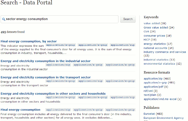
I’m a nosy neighbour. I like to know what’s going on in my area: who’s bought the house next door, local planning applications, any dodgy activity going on? My husband and I are both self employed so there is usually at least one of us out and about in Caversham during the day. That means we have the chance to chat with our local postman, workmen digging up the road, Police Community Support Officers doing their rounds and with people in the local shops, bank and post office. Crime, not surprisingly, is a major topic on our “watch list” and just over two years ago police forces in England and Wales started to provide access to local crime statistics via online maps. The new service allowed you to drill down to ward level and view trends in burglary, robbery, theft, vehicle crime, violent crime and anti-social behaviour.

The format varied from one police force to another. For example Thames Valley Police provided a basic map and tables of data:

Thames Valley Police 2008 crime rates

Others such as the Metropolitan Police included additional graphical representation of the statistics such as  bar charts:

Metropolitan Police 2008 Crime Rates

None of them pinned down incidents to individual streets or addresses but they did give you an idea of the level of crime in a particular neighbourhood, how it compared with the same period the previous year and whether it was high, above average, average, below average, low or no crime. They were short, though, on detailed definitions of what each category of crime included. I looked at these maps out of personal curiosity rather than using them for any serious business application, and I made certain assumptions such as murder being included under ‘Violence against the person’. That may not have been the case.

Some police forces placed obvious links to the information on their home pages whilst others buried the data in obscure corners of their web sites. The crime maps where then all moved to the CrimeMapper web site – the Thames Valley Police map can still be seen at http://maps.police.uk/view/thames-valley – but that has now been integrated into Police.uk website, which “includes street-level crime data and many other enhancements“.

All you have to do is go to http://www.police.uk/, type in your postcode, town, village or street into the search box and “get instant access to street-level crime maps and data, as well as details of your local policing team and beat meetings“. The first screen looks good with news of local meetings, events, recent tweets, YouTube videos and – as the home page promised – information on my local policing team.

Police UK page for RG4 5BE

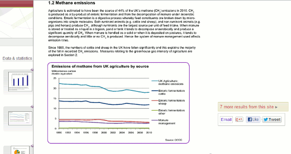
When I focus on the map to look at the detail there are markers for the location of the crimes and clicking on them gives you a brief description of the crime:

Detail on Police UK crime rates for Caversham

In this example, the detail box had details of two crimes “on or near Anglefield Road” and this is where I started to become confused. Were the burglary and the violent crime part  of the same incident or totally separate? Furthermore, if you look in the left hand panel of the screen you will see “To protect privacy, individual addresses are not pinpointed on the map. Crimes are mapped to an anonymous point on or near the road where they occurred.” Fair enough, but I would like to know how near ‘near’ is. 100, 200, 400 yards? Half a mile, a mile? And does the focus shift from one street to another from one month to the next? If it stays put then a street could gain a crime rate reputation that it does not deserve but if it shifts there is no way one can compare data from one month or year to another, which brings me to my next question.

Why is there only one month’s data? Previous versions of the crime maps gave you three months data for the current and the previous year for comparison. There is nothing about this in the Help section of  the Police UK site but the Guardian reports:

police forces have indicated that whenever a new set of data is uploaded – probably each month – the previous set will be removed from public view, making comparisons impossible unless outside developers actively store it.” (Crime maps are ‘worse than useless’, claim developers http://www.guardian.co.uk/technology/2011/feb/02/uk-crime-maps-developers-unhappy?CMP=twt_iph).

This means that if you want to run comparisons over time you will have to download the files and store them on your own system each month, or find someone else who is already doing it.

The Guardian article also says:

the Information Commissioner‘s Office (ICO) advised that tying crime reports to postcodes or streets with fewer than 12 addresses would render the individuals involved too identifiable. The police have also decided to remove data about murders or sexual assaults.

With respect to the latter the help file on the Police UK site suggests otherwise:

Crimes have been grouped into six categories following advice from the Information Commissioner’s Office. This doesn’t mean that the crimes listed under ‘other’ are not seen as important. Rather it ensures that for some of the more sensitive crimes there is even greater privacy for the victims.

So which is it: murders and sexual assaults are not included at all or aggregated under “other”? Jonathan Raper says on his blog Placr News (“Five reasons to be cautious about street level crime data” http://placr.co.uk/blog/2011/02/five-reasons-to-be-cautious-about-street-level-crime-data/):

Some data is redacted eg sexual offences, murder. The Metropolitan Police has already released this data to ward level though… and it is easy to cross-reference one murder in one ward to reports in the local press at the same time

Data visualisations and mashups are becoming increasingly popular and make it considerably easier to assess a situation and view trends. The Guardian Datablog (http://www.guardian.co.uk/news/datablog), for example, encourages people to take data sets, mash them up and create their own visualisations, and upload a screen shot to  the Guardian Datastore on Flickr (http://www.flickr.com/groups/1115946@N24/). It is vital, though, that the source of the data, whether the full data set or just a selection has been used, and whether or not it is going to be updated is clearly spelt out. All too often one or even all of these are missing from the accompanying notes, and in some cases there are no notes at all!

An example of good practice is “UK transport mapped: Every bus stop, train station, ferry port and taxi rank in Britain” (http://www.guardian.co.uk/news/datablog/2010/sep/27/uk-transport-national-public-data-repository). The posting clearly states the source (http://data.gov.uk/dataset/nptdr) and its coverage:

“A snapshot of every public transport journey in Great Britain for a selected week in October each year. The dataset is compiled with information from many sources, including local public transport information from each of the traveline regions, also coach services from the national coach services database and rail information from the Association of Train Operating Companies”

It then goes on to specify the time period  (5-11 October, 2009) and the tools that were used to create the visualisation.

Another is the “Live map of London Underground trains” (http://traintimes.org.uk/map/tube/). This shows “all trains on the London Underground network in approximately real time“. The source is a live data feed from Transport for London (TfL) and the notes state that a “small number of stations are misplaced or missing; occasional trains behave oddly; some H&C and Circle stations are missing in the TfL feed.” It would be helpful to have a list of those missing stations, but the site has at least brought the issue of potential missing data to the users’ attention.

Returning to the Police.uk crime data, there are three major problems with the site for me as a researcher:

1. Are all crimes included in the database, or are some such as murders and sexual assaults excluded altogether or aggregated under “other”? More detailed and unambiguous scope notes please.

2. The street data level is useless. The markers are not exact locations but “near” to, there is no definition of “near”, no information on how the position of the marker is calculated or the geographic radius that it covers. It would be better to return to aggregated data at the ward level.

3. There are no options for comparing time periods and it seems that historical data will not be available on the web site. An ad hoc researcher will have to spend time and effort tracking down a developer or a web site that is downloading and keeping copies of all of the datasets as they are published.

The new crime data web site is a retrograde step. We need transparency and clarity rather than the muddle and confusion that has been generated by the lack of information on what is being provided.

StatsWales: free statistics on Wales

When looking for UK official statistics many of us immediately think of http://www.statistics.gov.uk/. If you are looking for data on Wales, though, you really should be heading for the Welsh Assembly’s StatsWales at http://statswales.wales.gov.uk/. This is a free-to-use service that allows you to “view, manipulate, create and download tables from the most detailed official data on Wales”. You can run a keyword search on the data or simply browse the Reports folders.

StatsWales folders

The built in search option may be your best bet (Note: Google ‘site:’ search does not work on this data collection). Most of the tables, charts and reports are clearly labelled but there are some sections where all you are told is that the data is “Indicator 9a” or “Indicator 12c”, for example.  It is only when you click on the file that you discover it’s contents.

StatsWales Folders

You can also select subsets of the data and produce your own tables and charts. If you register you can create your own profile, design and save your reports.

StatsWales Charts

There are many options for viewing and manipulating the data on the web site itself and it can seem overwhelming at times. You may prefer to just download the data sets and work on them offline, but if you think you might be a regular user of the this site it is worth working through the tutorials and getting to grips with the StatsWales tools. You can register for e-mail notifications of changes to specific datasets and RSS feeds are also available to alert you to new sets that have been added to the site.