Category Archives: Assessing Quality

How to write totally misleading headlines for social media

Or how to seriously annoy intelligent people by telling deliberate lies.

A story about renewable energy has been doing the rounds within my social media circles,  and especially on FaceBook. It is an article from The Independent newspaper that has been eagerly shared by those with an interest in the subject.  The headline reads “Britain just managed to run entirely on renewable energy for six days”.

This is what it looks like on FaceBook:

britain_entriely_run_renewable_energy_1

My first thought was that, obviously, this was complete nonsense. Had all of the petrol and diesel powered cars in Britain been miraculously converted to electric and hundreds of charging points installed overnight? I think that we would have noticed, or perhaps I am living in a parallel universe where such things have not yet happened.  So I assumed that the writer of the article, or the sub-editor,  had done what some journalists are prone to do, which is to use the terms energy and electricity interchangeably. Even if they meant “electricity”  I still found the claim that all of our electricity had been generated from renewable sources for six days difficult to believe.

Look below the  headline and you will see that the first sentence says “More than half of the UK’s electricity has come from low-carbon sources for the first time, a new study has found.” That is more like it. Rather than “run entirely on renewable energy” we now have “half of the UK’s electricity has come from low-carbon sources” [my emphasis in both quotes]. But why does the title make the claim when straightaway the text tells a different story? And low carbon sources are not necessarily renewable, for example nuclear. As I keep telling people on my workshops, always click through to the original article and read it before you start sharing with your friends.

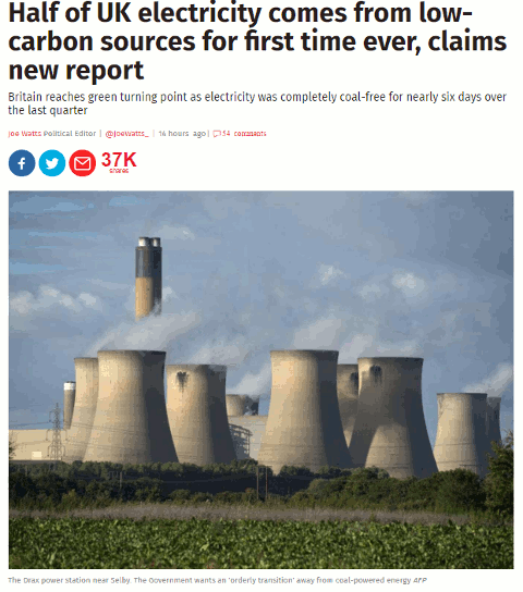
The title on the source article is very different from the facebook version as is the subtitle.
britain_entriely_run_renewable_energy_2
We now have the title “Half of UK electricity comes from low-carbon sources for first time ever, claims new report”, which is possibly more accurate. Note that “renewable” has gone and we have “low carbon sources” instead. Also, the subtitle muddies the waters further by referring to “coal- free”.

If you read the article in full it tells you that “electricity from low-emission sources had peaked at 50.2 per cent between July and September” and that happened for nearly six days during the quarter.  So we have half of electricity being generated by “low emission sources” but, again, that does not necessarily equate to renewables. The article does go on to say that the low emission sources included UK nuclear (26 per cent) , imported French nuclear,  biomass, hydro, wind and solar.  Nuclear may be low emission or low carbon but it is not a renewable.

Many of the other newspapers are regurgitating almost identical content that has all the hallmarks of a press release. As usual, hardly any of them give a link to the original report but most do say it is a collaboration between Drax and Imperial College London. If you want to see more details or the full report then you have to head off to your favourite search engine to hunt it down.  It can be found on the Drax Electric Insights webpage. Chunks of the report can be read online (click on Read Reports near the bottom of the homepage) or you can download the whole thing as a PDF. There is also an option on the Electric Insights homepage that enables you to explore the data in more detail.

This just leaves the question as to where the FaceBook version of the headline came from.  I suspected that a separate and very different headline had been specifically written for social media. I tested it by copying the URL and headline of the original article using a Chrome extension and pasted it into FaceBook. Sure enough, the headline automatically changed to the misleading title.

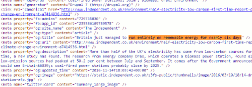
To see exactly what is going on and how, you need to look at the source code of the original article:
britain_entriely_run_renewable_energy_3

Buried in the meta data of page and tagged “og:title” is the headline that is displayed on FaceBook. This is the only place where it appears in the code.  The “og:title” is one of the open graph meta tags that tell FaceBook and other social media platforms what to display when someone shares the content. Thus you can have totally different “headlines” for the web and FaceBook that say completely different things.

Compare “Britain just managed to run entirely on renewable energy for six days” with “Half of UK electricity comes from low-carbon sources for first time ever, claims new report” and you have to admit that the former is more likely to get shared. That is how misinformation spreads. Always, always read articles in full before sharing and, if possible, try and find the original data or report. It is not always easy but we should all have learnt by now that we cannot trust politicians, corporates or the media to give us the facts and tell the full story.

Update: The original press release from DRAX “More than 50% of Britain’s electricity now low carbon according to ground-breaking new report

Debunking Euromyths

Those of us living in the UK have become accustomed to sensational headlines in the British press warning us that the European Union (EU) is about to ban British cucumbers, sausages, cheese, church bells, street acrobats [insert food or activity of your choice]. Tracking down the relevant EU legislation to find out whether or not there is any truth in the stories is a nightmare, and they are not the easiest of documents to read and understand when you do find them. But help is at hand from an EU blog called “European Commission in the UK – Euromyths and Letters to the Editor” at http://blogs.ec.europa.eu/ECintheUK/.

The blog covers scare stories that have appeared in the UK press, some of which go back to 1992, and explains what the situation really is and the relevant legislation.

Euromyths A-Z

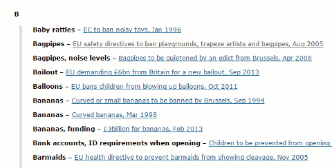
There is a neat A-Z index at   http://blogs.ec.europa.eu/ECintheUK/euromyths-a-z-index/ so you can quickly check, for example, if the EU is about to ban bagpipes:

As for banning bagpipes, Scots can rest assured that their favourite musical instrument is not under threat from EU proposals on noise pollution … they are designed primarily for those who work with loud machinery for a sustained period – more than 87 decibels for eight hours in a row. The law … will apply only to workers rather than audiences.  If, in the highly unlikely event a bagpipe player is hired to play continuously for eight hours, and the noise created averaged more than 87 decibels, the employer would be obliged to carry out a risk assessment to see where changes can be made – tinkering with the acoustics in a hall to reduce echoes, for example. If that fails, personal protection such as earmuffs will need to be considered, but only as a last resort. Banning musical instruments is not an option.

The blog is just one of many on the Europa website. A list can be found at Blogs of the European Commission.

And you thought Google couldn’t get any worse

We’ve all come across examples of how Google can get things wrong: incorrect supermarket opening hours (http://www.rba.co.uk/wordpress/2015/01/02/google-gets-it-wrong-again/), false information and dubious sources used in Quick Answers (http://www.rba.co.uk/wordpress/2014/12/08/the-quality-of-googles-results-is-becoming-more-strained/), authors who die 400 years before they are born (http://googlesystem.blogspot.co.uk/2013/11/google-knowledge-graph-gets-confused.html), a photo of the actress Jane Seymour ending up in a carousel of Henry VIII’s wives (http://www.slate.com/blogs/future_tense/2013/09/23/google_henry_viii_wives_jane_seymour_reveals_search_engine_s_blind_spots.html) and many more. What is concerning is that in many cases no source is given. According to Search Engine Land (http://searchengineland.com/google-shows-source-credit-quick-answers-knowledge-graph-203293) Google doesn’t provide a source link when the information is basic factual data and can be found in many places. But what if the basic factual data is wrong? It is worrying enough that incorrect or poor quality information is being presented in the Quick Answers at the top of our results and in the Knowledge Graph to the right, but the rot could spread to the main results.

An article in New Scientist (http://www.newscientist.com/article/mg22530102.600-google-wants-to-rank-websites-based-on-facts-not-links.html) suggests that Google may be looking at significantly changing the way in which it ranks websites by counting the number of false facts in a source and ranking by “truthfulness”. The article cites a paper by Google employees that has appeared in arXiv (http://arxiv.org/abs/1502.03519) “Knowledge-Based Trust: Estimating the Trustworthiness of Web Sources”. It is heavy going so you may prefer to stick with just abstract:

“The quality of web sources has been traditionally evaluated using exogenous signals such as the hyperlink structure of the graph. We propose a new approach that relies on endogenous signals, namely, the correctness of factual information provided by the source. A source that has few false facts is considered to be trustworthy. The facts are automatically extracted from each source by information extraction methods commonly used to construct knowledge bases. We propose a way to distinguish errors made in the extraction process from factual errors in the web source per se, by using joint inference in a novel multi-layer probabilistic model. We call the trustworthiness score we computed Knowledge-Based Trust (KBT). On synthetic data, we show that our method can reliably compute the true trustworthiness levels of the sources. We then apply it to a database of 2.8B facts extracted from the web, and thereby estimate the trustworthiness of 119M webpages. Manual evaluation of a subset of the results confirms the effectiveness of the method.”

If this is implemented in some way, and based on Google’s track record so far, I dread to think how much more time we shall have to spend on assessing each and every source that appears in our results. It implies that if enough people repeat something on the web it will deemed to be true and trustworthy, and that pages containing contradictory information may fall down in the rankings. The former is of concern because it is so easy to spread and duplicate mis-information throughout the web and social media. The latter is of concern because a good scientific review on a topic will present all points of view and inevitably contain multiple examples of contradictory information. How will Google allow for that?

It will all end in tears – ours, not Google’s.

Google gets it wrong again

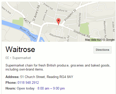
Yesterday, on New Year’s Day, I came across yet another example of Google getting its Knowledge Graph wrong. I wanted to double check which local shops were open and the first one on the list was Waitrose. I vaguely recalled seeing somewhere that the supermarket would be closed on January 1st but a Google search on waitrose opening hours caversham suggested otherwise. Google told me in its Knowledge Graph to the right of the search results that Waitrose was in fact open.

Waitrose New Years Day Opening according to Google

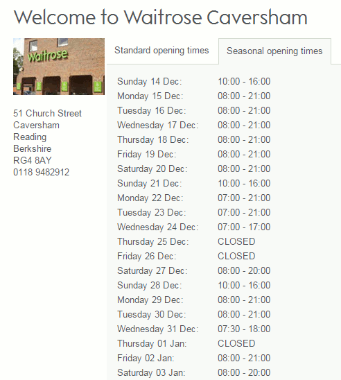
Knowing that Google often gets things wrong in its Quick Answers and Knowledge Graph I checked the Waitrose website. Sure enough, it said “Thursday 01 Jan: CLOSED”.

Waitrose New Year opening hours according to Waitrose

If you look at the above screenshot of the opening times you will see that there are two tabs: Standard and Seasonal. Google obviously used the Standard tab for its Knowledge Graph.

I was at home working from my laptop but had I been out and about I would have used my mobile, so I checked what that would have shown me. Taking up nearly all of the  screen was a map showing the supermarket’s location and the times 8:00 am – 9:00 pm. I had to scroll down to see the link to the Waitrose site so I might have been tempted to rely on what Google told me on the first screen. But I know better. Never trust Google’s Quick Answers or Knowledge Graph.

The quality of Google’s results is very strained

I recently received an email from a friend asking about whether it was acceptable for a student to cite Google as a source in their work. My friend’s instinct was to say no, but there was a problem getting beyond Google and to the original source of the answer. The student had used the Google define search option to find a definition of the term “leadership”, which Google duly did but failed to provide the source of the definition. My response to citing Google as a source is always “No” unless it is an example of  how Google presents results or a comment on the quality (or lack of it) of the information that has been found. The results that appear at the top of the results, such as the definitions or the new quick answers, have been created and compiled by someone else so Google should not get the credit for it. In addition, what is displayed by Google in response to the search will vary from day to day and in creating these quick answers Google sometimes introduces errors or gets it completely wrong.

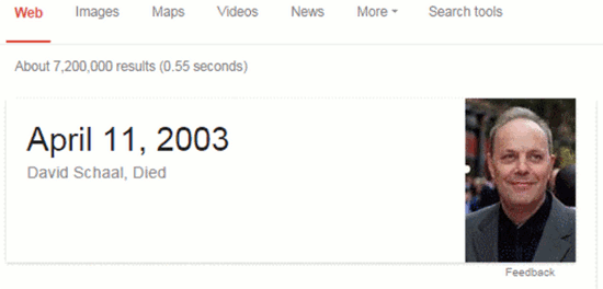
There have been several well documented instances of Google providing incorrect information in the knowledge graph to the right of search results and in the carousel that sometimes appears at the top of the page (see http://googlesystem.blogspot.co.uk/2013/11/google-knowledge-graph-gets-confused.html and http://www.slate.com/blogs/future_tense/2013/09/23/google_henry_viii_wives_jane_seymour_reveals_search_engine_s_blind_spots.html). The same problems beset the quick answers. For a short time, a Google search on David Schaal came up with a quick answer saying that he had died on April 11th, 2003! (As far as I am aware, he is still very much alive).

No source was given nor was there any indication of where this information had come from. Many have questioned Google on how it selects information for quick answers and why it does not always give the source. Google’s response is that it doesn’t provide a link when the information is basic factual data (http://searchengineland.com/google-shows-source-credit-quick-answers-knowledge-graph-203293), but as we have seen the “basic factual data” is sometimes wrong.

Quick answers above the Google results have been around for a while. Type in the name of a Premier League football club and Google will give you the results for the most recent match as well as the scores and schedule for the current season. Not being a fan myself I would have to spend some time checking the accuracy of that data or I could, like most people, accept what Google has given me as true. Looking for flights between two destinations? Google will come up with suggestions from its Google Flights; and this is where it starts to get really messy. I’ve played around with the flights option for several destinations. Although Google gives you an idea of which airlines fly between those two airports and possible costs, the specialist travel sites and airline websites give you a far wider range of options and cheaper deals. It is when we come to health related queries, though, that I have major concerns over what Google is doing.

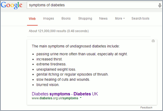
Try typing in a search along the lines of symptoms of [insert medical condition of your choice] and see what comes up. When I searched for symptoms of diabetes the quick answer that Google gave me was from Diabetes UK.

Google Quick Answer - symptoms of diabetes

At least Google gives the source for this type of query so that I can click through to the site for further information and assess the quality. In this case I am happy with the information and the website. Having worked in the past for an insulin manufacturer I am familiar with the organisation and the work it does. It was a very different story for some of the other medical conditions I searched for.

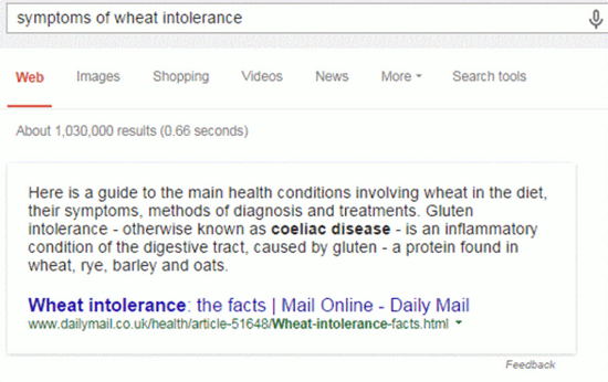
A search for symptoms of wheat intolerance gave me a quick answer from an Australian site whose main purpose seemed to be the sale of books on food allergies and intolerances, and very expensive self-diagnosis food diaries. The quality of information and advice on the topic was contradictory and sometimes wrong. The source for the quick answer for this query varied day by day and the quality ranged from appalling to downright dangerous. A few days ago, it was the Daily Mail that supplied the quick answer, which actually turned to be the best of the bunch, probably because the information had been copied from an authoritative site on the topic.

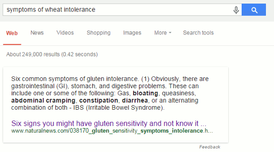
Today, Google unilaterally decided that I was actually interested in gluten sensitivity and gave me information from Natural News.

Google quick answer for wheat intolerance

I shall leave you to assess whether or not this page merits being a reliable, quick answer (the link to the page is http://www.naturalnews.com/038170_gluten_sensitivity_symptoms_intolerance.html).

Many of the sources that are used for a Google quick answer appear within the first three results for my searches and a few are listed at number four or five. This one, however, came in at number seven. Given that Google customises results one cannot really say whether or not the page’s position in the results is relevant or if Google uses some other way of determining what is used. Google does not say. In all of the medical queries I tested relevant pages from the NHS Choices website, which I expected to be a quick answer in at least a couple of queries, were number one or two in the results but they have never appeared as a quick answer.

Do not trust Google’s quick answers on medical queries, or anything else. Always click through to the website that has been used to provide the answer or, even better, work your way through the results yourself.

So what advice did I suggest my friend give their student? No, don’t cite Google. I already know who Google currently uses for its define command but a quick way to find out is to simply phrase search a chunk of the definition. That took me straight to an identical definition at Oxford Dictionaries (http://www.oxforddictionaries.com/), and I hope that is the source the student cited.

But it’s all free on Google

This is the presentation I am giving tomorrow (27th September 2012) at the East of England Information Services Group of CILIP at the Bury St Edmunds Library. The event is “Information integrity on a decreasing budget”. Many of the slides are just images so I am not really giving that much away by releasing the slides early. And before anyone asks, no, I will be not providing notes and I will not be providing a version with a voice over – at least for free. Some will soon be made available in the resurrected Search Strategies section of my web site at http://www.rba.co.uk/search/index.shtml and in the subscription area only.

The straightforward, no notes, no voice over slides are available at

http://www.rba.co.uk/as/ – available for a few weeks only

http://www.authorstream.com/Presentation/karenblakeman-1549834-39-free-google/

http://www.slideshare.net/KarenBlakeman/but-its-all-free-on-google

UK crime data as clear as mud

I’m a nosy neighbour. I like to know what’s going on in my area: who’s bought the house next door, local planning applications, any dodgy activity going on? My husband and I are both self employed so there is usually at least one of us out and about in Caversham during the day. That means we have the chance to chat with our local postman, workmen digging up the road, Police Community Support Officers doing their rounds and with people in the local shops, bank and post office. Crime, not surprisingly, is a major topic on our “watch list” and just over two years ago police forces in England and Wales started to provide access to local crime statistics via online maps. The new service allowed you to drill down to ward level and view trends in burglary, robbery, theft, vehicle crime, violent crime and anti-social behaviour.

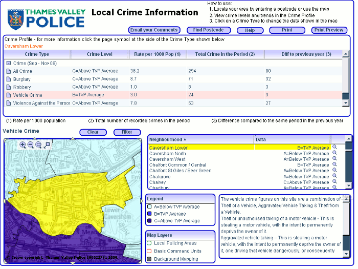
The format varied from one police force to another. For example Thames Valley Police provided a basic map and tables of data:

Thames Valley Police 2008 crime rates

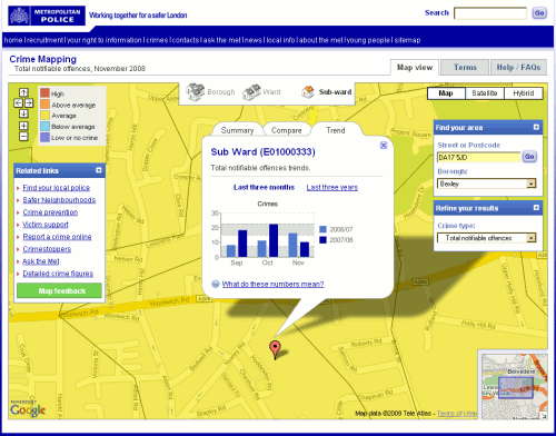
Others such as the Metropolitan Police included additional graphical representation of the statistics such as  bar charts:

Metropolitan Police 2008 Crime Rates

None of them pinned down incidents to individual streets or addresses but they did give you an idea of the level of crime in a particular neighbourhood, how it compared with the same period the previous year and whether it was high, above average, average, below average, low or no crime. They were short, though, on detailed definitions of what each category of crime included. I looked at these maps out of personal curiosity rather than using them for any serious business application, and I made certain assumptions such as murder being included under ‘Violence against the person’. That may not have been the case.

Some police forces placed obvious links to the information on their home pages whilst others buried the data in obscure corners of their web sites. The crime maps where then all moved to the CrimeMapper web site – the Thames Valley Police map can still be seen at http://maps.police.uk/view/thames-valley – but that has now been integrated into Police.uk website, which “includes street-level crime data and many other enhancements“.

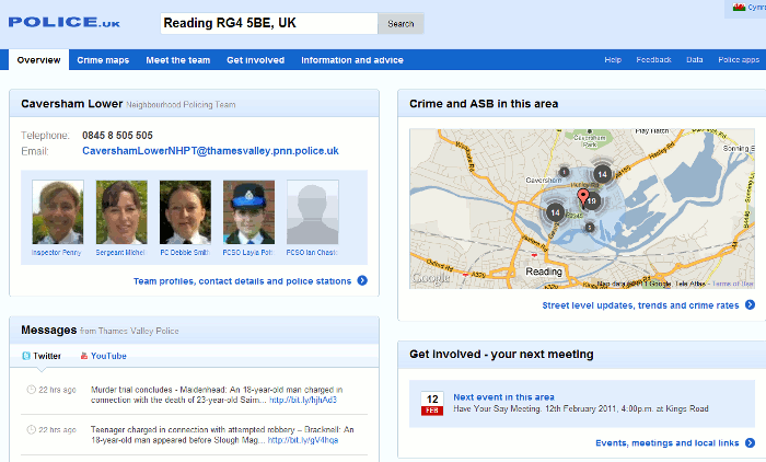
All you have to do is go to http://www.police.uk/, type in your postcode, town, village or street into the search box and “get instant access to street-level crime maps and data, as well as details of your local policing team and beat meetings“. The first screen looks good with news of local meetings, events, recent tweets, YouTube videos and – as the home page promised – information on my local policing team.

Police UK page for RG4 5BE

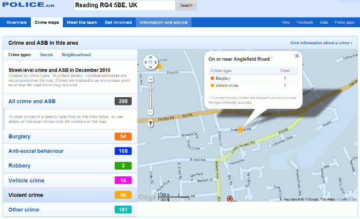
When I focus on the map to look at the detail there are markers for the location of the crimes and clicking on them gives you a brief description of the crime:

Detail on Police UK crime rates for Caversham

In this example, the detail box had details of two crimes “on or near Anglefield Road” and this is where I started to become confused. Were the burglary and the violent crime part  of the same incident or totally separate? Furthermore, if you look in the left hand panel of the screen you will see “To protect privacy, individual addresses are not pinpointed on the map. Crimes are mapped to an anonymous point on or near the road where they occurred.” Fair enough, but I would like to know how near ‘near’ is. 100, 200, 400 yards? Half a mile, a mile? And does the focus shift from one street to another from one month to the next? If it stays put then a street could gain a crime rate reputation that it does not deserve but if it shifts there is no way one can compare data from one month or year to another, which brings me to my next question.

Why is there only one month’s data? Previous versions of the crime maps gave you three months data for the current and the previous year for comparison. There is nothing about this in the Help section of  the Police UK site but the Guardian reports:

police forces have indicated that whenever a new set of data is uploaded – probably each month – the previous set will be removed from public view, making comparisons impossible unless outside developers actively store it.” (Crime maps are ‘worse than useless’, claim developers http://www.guardian.co.uk/technology/2011/feb/02/uk-crime-maps-developers-unhappy?CMP=twt_iph).

This means that if you want to run comparisons over time you will have to download the files and store them on your own system each month, or find someone else who is already doing it.

The Guardian article also says:

the Information Commissioner‘s Office (ICO) advised that tying crime reports to postcodes or streets with fewer than 12 addresses would render the individuals involved too identifiable. The police have also decided to remove data about murders or sexual assaults.

With respect to the latter the help file on the Police UK site suggests otherwise:

Crimes have been grouped into six categories following advice from the Information Commissioner’s Office. This doesn’t mean that the crimes listed under ‘other’ are not seen as important. Rather it ensures that for some of the more sensitive crimes there is even greater privacy for the victims.

So which is it: murders and sexual assaults are not included at all or aggregated under “other”? Jonathan Raper says on his blog Placr News (“Five reasons to be cautious about street level crime data” http://placr.co.uk/blog/2011/02/five-reasons-to-be-cautious-about-street-level-crime-data/):

Some data is redacted eg sexual offences, murder. The Metropolitan Police has already released this data to ward level though… and it is easy to cross-reference one murder in one ward to reports in the local press at the same time

Data visualisations and mashups are becoming increasingly popular and make it considerably easier to assess a situation and view trends. The Guardian Datablog (http://www.guardian.co.uk/news/datablog), for example, encourages people to take data sets, mash them up and create their own visualisations, and upload a screen shot to  the Guardian Datastore on Flickr (http://www.flickr.com/groups/1115946@N24/). It is vital, though, that the source of the data, whether the full data set or just a selection has been used, and whether or not it is going to be updated is clearly spelt out. All too often one or even all of these are missing from the accompanying notes, and in some cases there are no notes at all!

An example of good practice is “UK transport mapped: Every bus stop, train station, ferry port and taxi rank in Britain” (http://www.guardian.co.uk/news/datablog/2010/sep/27/uk-transport-national-public-data-repository). The posting clearly states the source (http://data.gov.uk/dataset/nptdr) and its coverage:

“A snapshot of every public transport journey in Great Britain for a selected week in October each year. The dataset is compiled with information from many sources, including local public transport information from each of the traveline regions, also coach services from the national coach services database and rail information from the Association of Train Operating Companies”

It then goes on to specify the time period  (5-11 October, 2009) and the tools that were used to create the visualisation.

Another is the “Live map of London Underground trains” (http://traintimes.org.uk/map/tube/). This shows “all trains on the London Underground network in approximately real time“. The source is a live data feed from Transport for London (TfL) and the notes state that a “small number of stations are misplaced or missing; occasional trains behave oddly; some H&C and Circle stations are missing in the TfL feed.” It would be helpful to have a list of those missing stations, but the site has at least brought the issue of potential missing data to the users’ attention.

Returning to the Police.uk crime data, there are three major problems with the site for me as a researcher:

1. Are all crimes included in the database, or are some such as murders and sexual assaults excluded altogether or aggregated under “other”? More detailed and unambiguous scope notes please.

2. The street data level is useless. The markers are not exact locations but “near” to, there is no definition of “near”, no information on how the position of the marker is calculated or the geographic radius that it covers. It would be better to return to aggregated data at the ward level.

3. There are no options for comparing time periods and it seems that historical data will not be available on the web site. An ad hoc researcher will have to spend time and effort tracking down a developer or a web site that is downloading and keeping copies of all of the datasets as they are published.

The new crime data web site is a retrograde step. We need transparency and clarity rather than the muddle and confusion that has been generated by the lack of information on what is being provided.

iPhone 4 to be recalled: it’s true – the Daily Mail says so

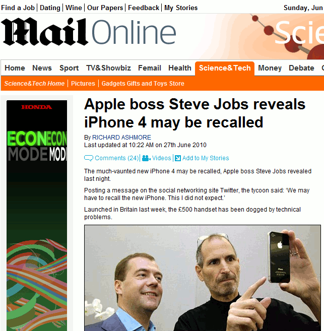
The Daily Mail has done it again and proved that the quality of their research is second to none, because they don’t do any. They have an exclusive on the possible product recall of the iPhone 4. You can see the article on the Daily Mail site at http://www.dailymail.co.uk/sciencetech/article-1289965/Apple-iPhone-4-recalled-says-Steve-Jobs.html, or possibly not. By the time you read this posting the Daily Mail might have realised that they have made complete idiots of themselves and removed the story. So here is a screen shot of the headline:

Daily Mail get it wrong again

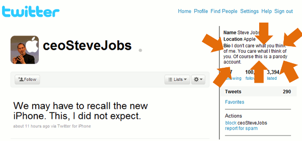
The source of the story? The man himself: Apple CEO Steve Jobs announced the possible recall last night via his Twitter account @ceoSteveJobs. There’s just one teensy weensy problem. The ‘bio’ for @ceoSteveJobs clearly states:

“I don’t care what you think of me. You care what I think of you. Of course this is a parody account.”

Perhaps the Daily Mail does not understand what parody is? Or maybe the ability to read is no longer a requirement for Daily Mail journalists?

Checking the authority and veracity of a source is an important part of research as those of us who do this for a living well know. It can be a time consuming and long-winded process but in this case it was clearly stated on the Twitter account that the source was A PARODY ACCOUNT. How difficult is it to read the profile on this account?

Steve Jobe Twiiter Parody Account

No doubt the Daily Mail will now regale us with tales of how Twitter is riddled with liars, fakes and false information and that it should be immediately banned from these shores.

Time to sing along to that popular ditty “The Daily Mail Song” by Dan and Dan http://www.youtube.com/watch?v=5eBT6OSr1TI

And as I finish writing this I see that the Daily Mail have pulled the story from their web site. If you are desperate to see a copy of the original I have one here. It will feature in my workshops on assessing the quality of information!

Assessing the Quality of Information: Top Tips

Or: Paranoia ‘r’ us

This is a list of Top 10 Tips that the participants of Assessing the Quality of Information compiled at the end of a workshop held at TFPL in London on 31st October 2006. On a scale of 1 to 10, most of the delegates started out with a paranoia level of around 7 or 8. By the time they had worked through half the exercises a couple of them had increased that to 25-30! Paranoia had eased off slightly by the end of the day and at least they had a toolkit at their finger tips that they could use to help evaluate and assess the quality and validity of information.

  1. Check who is behind the domain name of a web site using www.allwhois.com . The contact details sometimes just give the ISP or service who organised the domain name for the web site owner but at least it is a starting point if you need to contact the owner to discuss any issues about the content. If someone really wishes to hide, they can use an agent to do the registration for them and in that case there is little one can do to track down the real owner. Note that you can only find out who owns a domain name; you cannot take a person’s or company’s name and find out which domain names they own.
  2. Try the Wayback Machine (Internet Archive) (www.archive.org) for tracking down pages or sites that have disappeared. Type in the web site URL or the URL of the document/page you have ‘lost’. This can pick up pages no longer cached by the search engines (see number 3 below). This trick is not guaranteed: some sites have asked to be removed from the archive or have designed their pages so that they automatically refresh to the most recent page. This can also be a useful tool for reviewing how a company presented itself on the web in the past and how organisations have evolved, both of which can be useful components of assessing quality.
  3. Look at the search engine cached copies of pages for more recent past pages. This is especially useful if the current web page that you found via Google et al does not seem to resemble your search strategy in any way. The cached copy is the copy that the search engine has in its index and it will also highlight your search terms within the page.
  4. Use links to and from the site or page to find pages that are similar to a known quality page (pages of similar content tend to link to one another), or to see what other people saying about the page in terms of quality and the authority and of those that link to it. Use Windows Live (www.live.com) . For pages that link in to your known or ‘suspect’ page use the link and linkdomain commands.Link will find pages that link to an individual page, for example: link:www.rba.co.uk/sources/stats.htm

    Linkdomain will find pages that link to anywhere within a web site, for example:
    linkdomain:rba.co.uk

    To find out what page a site links to (can give you an idea of bias, political stance, ideology etc) use linkfromdomain, for example: linkfromdomain:rba.co.uk

  5. Use ‘hoaxbusting’ sites for if you are suspicious about a site or a ‘well known and accepted fact’. Examples are:
    www.snopes.com
    hoaxbusters.ciac.org
    www.vmyths.com (concentrates on virus myths and hoaxes)
    www.regrettheerror.com
  6. If relevant and appropriate double check information and data with other independent sources (not always possible and you may find yourself going round on circles chasing sources that quote each other!)
  7. Use the search engine advanced options to focus your search. For example the domain and site command or box to limit your search to, for example, UK government sites (gov.uk), academic sites (.ac.uk, .edu etc), a known trusted site.
  8. Use different search tools and their features to give you results that are prioritised in a different order or for suggestions on alternative search strategies:
    Yahoosearch.yahoo.co.uk – for results sorted in a different order from Google
    AltheWeb LivesearchLivesearch.alltheweb.com – for results that change as you type and suggestions for alternative search terms
    Askwww.ask.co.uk – for ways of narrowing down or broadening your search
    Exaleadwww.exalead.com – for its unique advanced search commands and related terms
    Windows Livewww.live.com – for its link, linkdomain and linkfromdomain commandsThink about using different types of resources for example reference sources, video/audio, blogs and RSS feeds (yes, there are some good ones around!). Have a look at Trovando (www.trovando.it ) for some starting points. And don’t forget evaluated listing such as Intute (www.intute.ac.uk) and, for business, Alacrawiki (www.alacrawiki.com ).
  9. If you are looking for up date to market research etc. use market research content aggregators to identify who is publishing on a topic and go direct to the publisher. Individual publishers do not always give their full catalogue to the aggregators, may embargo their information for weeks or months, and may have more up to date information on their web site. You can also sometimes get a better deal by going direct to the publisher.
  10. Dates. Compared with structured databases, proper and accurate date searching is almost impossible with Google et al. A web page is assigned a date by the web server when it is loaded or reloaded onto the web site. It is not when the information was gathered or written. The web server date is the one that the search engines look at when you use the date option in the advanced search. Neither should you automatically trust the date that so often appears at the bottom of a page. It may be accurate and reflect the date of the content, but pages can be set-up to incorporate the date the page was loaded or reloaded onto the site, the date when minor changes are made, or even today’s date 🙁 If the date is not obvious from the content, contact the author.

Two additional general points were made in conclusion:

  • it is important to build up your own personal collection of sites, relevant to your sector and applications, and that you have already quality assessed and trust
  • errors and misleading information are not new and pre-date the Internet era. Nothing has changed in that mistakes and bias in the media – whatever form – are a fact of life. What has changed is that everyone now has the opportunity to become involved in creating and perpetuating myths and mis-information, which means that we have to wade through so much more rubbish and spend more time separating the gold from the dross.

Intute – the best Web resources for education and research

A reminder that the Resource Discovery Network (RDN) has been replaced by Intute.

“Intute is a free online service providing you with access to the very best Web resources for education and research. The service is created by a network of UK universities and partners. Subject specialists select and evaluate the websites in our database and write high quality descriptions of the resources.”

I find the new service much easier to navigate and I can find relevant gateways much more quickly than with the old RDN. There are 4 main areas: Science & Technology; Arts & Humanities; Social Sciences; and Health & Life Sciences. If you are intrested in business information, the resources covered by the busines and management section of SOSIG are now at http://www.intute.ac.uk/socialsciences/business/. Although their target audience is students, staff and researchers in higher and further education this collection of resources is of value to anyone who uses business information.