I recently mentioned Gridwatch (How the UK’s electricity is generated  http://www.rba.co.uk/wordpress/2013/08/21/how-the-uks-electricity-is-generated/) as a way of tracking how much energy is passing through the National Grid and the technology used to generate that electricity. Although Gridwatch is a great way of observing the total amount of electricity that is generated by each technology – gas, coal, wind etc – it does not go into any detail with respect to individual installations. The Digest of UK energy statistics (DUKES) produced by the UK  Department of Energy & Climate Change (http://www.gov.uk/government/organisations/department-of-energy-climate-change/series/digest-of-uk-energy-statistics-dukes) includes a spreadsheet listing all of the operational power stations, fuel that they use, installed capacity, location, and the year that generation began. The direct link to the spreadsheet is http://www.gov.uk/government/uploads/system/uploads/attachment_data/file/226895/dukes5_11.xls. This is historical data and the current list refers to plants in operation at the end of May 2013.
UK Energy Watch has a map (http://www.ukenergywatch.org/Electricity/PowerStations) showing the location of UK power stations of 400 MW or larger, so it is by no means comprehensive. It does allow you, though, to click on a plant and display current generation except for CCGT stations (Combined Cycle Gas Turbine).
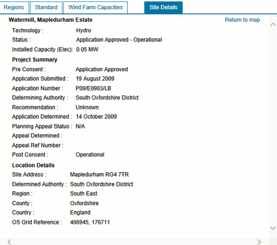
There are more options available when it comes to what are called renewables (for example wind, solar, biomass, hydro). The DECC’s RESTATS interactive map at http://restats.decc.gov.uk/app/pub/map/map/ enables you to search by technology, region, county, planning authority and application status. It also has a separate map for wind farm capacities.

The site information includes installed capacity, details of the planning application but not how much energy is actually being produced. RESTATS says that “Information is held on the performance of operational projects but owing to the need to maintain the commercially sensitive nature of these data, specific site details and performance figures are not disclosed“.
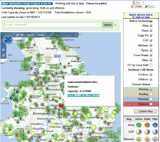
The UK Data explorer has produced a renewables map at http://ukdataexplorer.com/renewables/ that uses the RESTATS data and shows operational renewable electricity sites over 0.01 MW. The different colours represent the type of plant and the area of the circles indicate installed capacity (maximum power output).

To see details of a specific installation you should be able to hover over a point on the map. This did not work for me with some of the smaller plants and when I tried to zoom in on an area I often lost the background map.
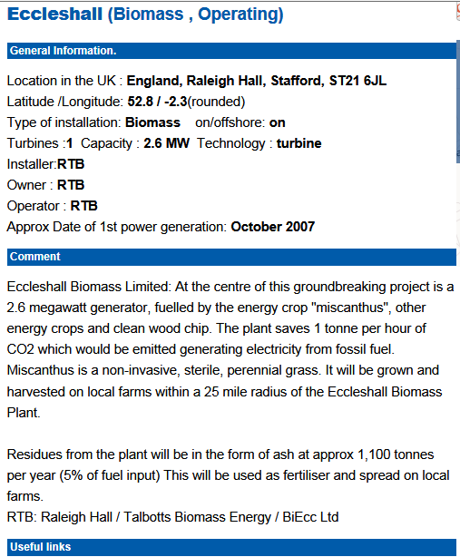
The Interactive Map of Renewable and Alternative Energy Projects in the UK at http://www.renewables-map.co.uk is another interactive map and can be filtered by technology type and planning status.
According to the website the information is gathered from “a wide range of web resources, in all cases these will be referenced, usually by a link to that information. Locations are either taken from existing data, usually from planning applications, or by painstakingly identifying the location on the ground using online maps.” I am not sure how up to date the map is and I noticed that the smaller hydro installations along the Thames are missing. Another problem that I have experienced with this site is that when I click on “More details” for an installation I get far too many “internal sever errors”. However, when the information does appear it includes useful comments on the technology, links to relevant websites and the latest news.
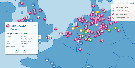
The final one in my list is from the energy generating company RWE Innogy (http://www.rwe.com/web/cms/en/194914/rwe-innogy/sites/production-data-live/). Its interactive map provides information on most of its European plants and includes wind farms, hydro power plants and biomass CHP (Combined Heat and Power). The production data is updated every minute. To see information on an installation, click on its icon on the map. The information includes live production, location, type of installation and when production started.
These are by no means the only websites offering interactive maps and information on UK energy production, and none of them give the full picture. They are good starting points, though, if you are interested in researching individual technologies or individual power stations.