Tag Archives: assessing quality

How to write totally misleading headlines for social media

Or how to seriously annoy intelligent people by telling deliberate lies.

A story about renewable energy has been doing the rounds within my social media circles,  and especially on FaceBook. It is an article from The Independent newspaper that has been eagerly shared by those with an interest in the subject.  The headline reads “Britain just managed to run entirely on renewable energy for six days”.

This is what it looks like on FaceBook:

britain_entriely_run_renewable_energy_1

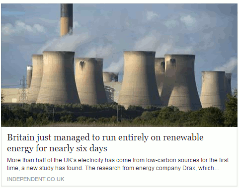
My first thought was that, obviously, this was complete nonsense. Had all of the petrol and diesel powered cars in Britain been miraculously converted to electric and hundreds of charging points installed overnight? I think that we would have noticed, or perhaps I am living in a parallel universe where such things have not yet happened.  So I assumed that the writer of the article, or the sub-editor,  had done what some journalists are prone to do, which is to use the terms energy and electricity interchangeably. Even if they meant “electricity”  I still found the claim that all of our electricity had been generated from renewable sources for six days difficult to believe.

Look below the  headline and you will see that the first sentence says “More than half of the UK’s electricity has come from low-carbon sources for the first time, a new study has found.” That is more like it. Rather than “run entirely on renewable energy” we now have “half of the UK’s electricity has come from low-carbon sources” [my emphasis in both quotes]. But why does the title make the claim when straightaway the text tells a different story? And low carbon sources are not necessarily renewable, for example nuclear. As I keep telling people on my workshops, always click through to the original article and read it before you start sharing with your friends.

The title on the source article is very different from the facebook version as is the subtitle.

britain_entriely_run_renewable_energy_2
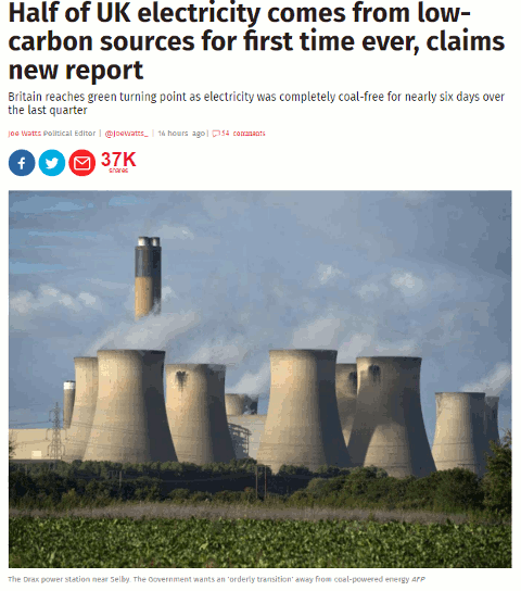
We now have the title “Half of UK electricity comes from low-carbon sources for first time ever, claims new report”, which is possibly more accurate. Note that “renewable” has gone and we have “low carbon sources” instead. Also, the subtitle muddies the waters further by referring to “coal- free”.

If you read the article in full it tells you that “electricity from low-emission sources had peaked at 50.2 per cent between July and September” and that happened for nearly six days during the quarter.  So we have half of electricity being generated by “low emission sources” but, again, that does not necessarily equate to renewables. The article does go on to say that the low emission sources included UK nuclear (26 per cent) , imported French nuclear,  biomass, hydro, wind and solar.  Nuclear may be low emission or low carbon but it is not a renewable.

Many of the other newspapers are regurgitating almost identical content that has all the hallmarks of a press release. As usual, hardly any of them give a link to the original report but most do say it is a collaboration between Drax and Imperial College London. If you want to see more details or the full report then you have to head off to your favourite search engine to hunt it down.  It can be found on the Drax Electric Insights webpage. Chunks of the report can be read online (click on Read Reports near the bottom of the homepage) or you can download the whole thing as a PDF. There is also an option on the Electric Insights homepage that enables you to explore the data in more detail.

This just leaves the question as to where the FaceBook version of the headline came from.  I suspected that a separate and very different headline had been specifically written for social media. I tested it by copying the URL and headline of the original article using a Chrome extension and pasted it into FaceBook. Sure enough, the headline automatically changed to the misleading title.

To see exactly what is going on and how, you need to look at the source code of the original article:

britain_entriely_run_renewable_energy_3

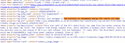
Buried in the meta data of page and tagged “og:title” is the headline that is displayed on FaceBook. This is the only place where it appears in the code.  The “og:title” is one of the open graph meta tags that tell FaceBook and other social media platforms what to display when someone shares the content. Thus you can have totally different “headlines” for the web and FaceBook that say completely different things.

Compare “Britain just managed to run entirely on renewable energy for six days” with “Half of UK electricity comes from low-carbon sources for first time ever, claims new report” and you have to admit that the former is more likely to get shared. That is how misinformation spreads. Always, always read articles in full before sharing and, if possible, try and find the original data or report. It is not always easy but we should all have learnt by now that we cannot trust politicians, corporates or the media to give us the facts and tell the full story.

Update: The original press release from DRAX “More than 50% of Britain’s electricity now low carbon according to ground-breaking new report

Searching for the height of Ben Nevis – how hard can it be?

If you have attended one of my recent search workshops, or glanced through the slides, you will have noticed that I have a new test query: the height of Ben Nevis. It didn’t start out as a test search but as a genuine query from me.  A straightforward search, I thought, even for Google.

I typed in the query ‘height of ben nevis’ and across the top of the screen Google emblazoned the answer: 1345 metres.  That sort of rang a bell and sounded about right, but as with many of Google’s Quick Answers there was no source and I do like to double or even triple check anything that Google comes up with.

Ben_Nevis_1

To the right of the screen was a Google Knowledge Graph with an extract from Wikipedia telling me that Ben Nevis stands at not 1345 but 1346 metres above sea level. Additional information below that says the mountain has an elevation of 1345 metres and a prominence of 1344 metres (no sources given). I know have three different heights – and what is ‘prominence’?

Ben-Nevis-3

After a little more research I discovered that prominence is not the same as elevation, but I shall leave  you to investigate that for yourselves if you are interested. The main issue for me was that Google was giving me at least three slightly different answers for the height of Ben Nevis, so it was time to read some of the results in full.

Before I got around to clicking on the first of the two articles at the top of the results, alarm bells started ringing.  One of the metres to feet conversions in the snippets did not look right.

Height of Ben Nevis search results 3

So I ran my own conversions for both sets of metres to feet and in the other direction (feet to metres):

1344m = 4409.499ft, rounded down to 4409ft

4406ft = 1342.949m, rounded up to 1343m

1346m = 4416.01ft, rounded down to 4416ft

4414ft = 1345.387m, rounded down to 1345m

As if finding three different heights was not bad enough, it seems that the contributors to the top two articles are incapable of carry out simple ft/m conversions, but I suspect that  a rounding up and rounding down of the figures before the calculations were carried out is the cause of the discrepancies.

The above results came from a search on Google.co.uk. Google.com gave me similar results but with a Quick Answer in feet, not metres.

Ben-Nevis-4

We still do not have a reliable answer regarding the height of Ben Nevis.

Three articles below the top two results were from BBC News, The Guardian and Ordnance Survey – the most relevant and authoritative for this query –  and were about the height of Ben Nevis having been remeasured earlier this year using GPS. The height on the existing Ordnance Survey maps had been given as 1344m but the more accurate GPS measurements came out at 1344.527m or 4411ft 2in. The original Ordnance Survey article explains that this is only a few centimetres different from the earlier 1949 assessment but it means that the final number has had to be rounded up rather than down. The official height on OS maps has therefore been increased from 1344m to 1345m.  So Google’s Quick Answer at the top of the results page was indeed correct.

Why make a fuss about what are, after all, relatively small variations in the figures? Because there is one official height for the mountain and one of the three figures that Google was giving me (1346m) was neither the current nor the previous height. Looking at the commentary behind the Wikipedia article, which gave 1346m, it seems that the contributors were trying to reconcile the height in metres with the height in feet but carrying out the conversion using rounded up or rounded down figures. As one of my science teachers taught me long ago, you should always carry forward to the next stage of your calculations as many figures after the decimal point as possible. Only when you get to the end do you round up or down, if it is appropriate to do so. And imagine if your Pub Quiz team lost the local championship because you had correctly answered 1345m  to this question but the MC  had 1346m down as the correct figure? There’d be a riot if not all out war!

That’s what Google gave us. How did Bing fare?

The US and UK versions of Bing gave results that looked very similar to Google’s but  with two different quick answers in feet, and neither gave sources:

Bing UK

Ben-Nevis-Bing-UK

Bing US

Bing-Ben-Nevis-US

I won’t bore you with all of the other search tools that I tried except for Wolfram Alpha. This gave me 1343 meters or 4406 ft. At least the conversion is correct but there is no direct information on where the data has been taken from.

Ben-Nevis-WA

The sources link was of no help whatsoever and referred me to the home pages of the sites and not the Ben Nevis specific data. On some of the sites, when I did find the Ben Nevis pages, the figures were different from those shown by Wolfram Alpha so I have no idea how Wolfram arrived at 1343 meters.

So, the answer to my question “How high is Ben Nevis?” is 1344.527m rounded up on OS maps to 1345m.

And the main lessons from this exercise are:

  1. Never trust the quick answers or knowledge graphs from any of the search engines, especially if no source is given. But you knew that anyway, didn’t you?
  2. If you are seeing even small variations in the figures, and there are calculations or conversions involved, double check them yourself.
  3. Don’t skim read the results and use information highlighted in the snippets – read the full articles and from more than one source.
  4. Make sure that the articles you use are not just copying what others have said.
  5. Try and find the most relevant and authoritative source for your query, and ideally a primary source. In this case it was Ordnance Survey. GB officially taller – Ben Nevis  https://www.ordnancesurvey.co.uk/about/news/2016/gb-officially-taller-ben-nevis.html

Google gets it wrong again

Yesterday, on New Year’s Day, I came across yet another example of Google getting its Knowledge Graph wrong. I wanted to double check which local shops were open and the first one on the list was Waitrose. I vaguely recalled seeing somewhere that the supermarket would be closed on January 1st but a Google search on waitrose opening hours caversham suggested otherwise. Google told me in its Knowledge Graph to the right of the search results that Waitrose was in fact open.

Waitrose New Years Day Opening according to Google

Knowing that Google often gets things wrong in its Quick Answers and Knowledge Graph I checked the Waitrose website. Sure enough, it said “Thursday 01 Jan: CLOSED”.

Waitrose New Year opening hours according to Waitrose

If you look at the above screenshot of the opening times you will see that there are two tabs: Standard and Seasonal. Google obviously used the Standard tab for its Knowledge Graph.

I was at home working from my laptop but had I been out and about I would have used my mobile, so I checked what that would have shown me. Taking up nearly all of the  screen was a map showing the supermarket’s location and the times 8:00 am – 9:00 pm. I had to scroll down to see the link to the Waitrose site so I might have been tempted to rely on what Google told me on the first screen. But I know better. Never trust Google’s Quick Answers or Knowledge Graph.

The quality of Google’s results is very strained

I recently received an email from a friend asking about whether it was acceptable for a student to cite Google as a source in their work. My friend’s instinct was to say no, but there was a problem getting beyond Google and to the original source of the answer. The student had used the Google define search option to find a definition of the term “leadership”, which Google duly did but failed to provide the source of the definition. My response to citing Google as a source is always “No” unless it is an example of  how Google presents results or a comment on the quality (or lack of it) of the information that has been found. The results that appear at the top of the results, such as the definitions or the new quick answers, have been created and compiled by someone else so Google should not get the credit for it. In addition, what is displayed by Google in response to the search will vary from day to day and in creating these quick answers Google sometimes introduces errors or gets it completely wrong.

There have been several well documented instances of Google providing incorrect information in the knowledge graph to the right of search results and in the carousel that sometimes appears at the top of the page (see http://googlesystem.blogspot.co.uk/2013/11/google-knowledge-graph-gets-confused.html and http://www.slate.com/blogs/future_tense/2013/09/23/google_henry_viii_wives_jane_seymour_reveals_search_engine_s_blind_spots.html). The same problems beset the quick answers. For a short time, a Google search on David Schaal came up with a quick answer saying that he had died on April 11th, 2003! (As far as I am aware, he is still very much alive).

No source was given nor was there any indication of where this information had come from. Many have questioned Google on how it selects information for quick answers and why it does not always give the source. Google’s response is that it doesn’t provide a link when the information is basic factual data (http://searchengineland.com/google-shows-source-credit-quick-answers-knowledge-graph-203293), but as we have seen the “basic factual data” is sometimes wrong.

Quick answers above the Google results have been around for a while. Type in the name of a Premier League football club and Google will give you the results for the most recent match as well as the scores and schedule for the current season. Not being a fan myself I would have to spend some time checking the accuracy of that data or I could, like most people, accept what Google has given me as true. Looking for flights between two destinations? Google will come up with suggestions from its Google Flights; and this is where it starts to get really messy. I’ve played around with the flights option for several destinations. Although Google gives you an idea of which airlines fly between those two airports and possible costs, the specialist travel sites and airline websites give you a far wider range of options and cheaper deals. It is when we come to health related queries, though, that I have major concerns over what Google is doing.

Try typing in a search along the lines of symptoms of [insert medical condition of your choice] and see what comes up. When I searched for symptoms of diabetes the quick answer that Google gave me was from Diabetes UK.

Google Quick Answer - symptoms of diabetes

At least Google gives the source for this type of query so that I can click through to the site for further information and assess the quality. In this case I am happy with the information and the website. Having worked in the past for an insulin manufacturer I am familiar with the organisation and the work it does. It was a very different story for some of the other medical conditions I searched for.

A search for symptoms of wheat intolerance gave me a quick answer from an Australian site whose main purpose seemed to be the sale of books on food allergies and intolerances, and very expensive self-diagnosis food diaries. The quality of information and advice on the topic was contradictory and sometimes wrong. The source for the quick answer for this query varied day by day and the quality ranged from appalling to downright dangerous. A few days ago, it was the Daily Mail that supplied the quick answer, which actually turned to be the best of the bunch, probably because the information had been copied from an authoritative site on the topic.

Today, Google unilaterally decided that I was actually interested in gluten sensitivity and gave me information from Natural News.

Google quick answer for wheat intolerance

I shall leave you to assess whether or not this page merits being a reliable, quick answer (the link to the page is http://www.naturalnews.com/038170_gluten_sensitivity_symptoms_intolerance.html).

Many of the sources that are used for a Google quick answer appear within the first three results for my searches and a few are listed at number four or five. This one, however, came in at number seven. Given that Google customises results one cannot really say whether or not the page’s position in the results is relevant or if Google uses some other way of determining what is used. Google does not say. In all of the medical queries I tested relevant pages from the NHS Choices website, which I expected to be a quick answer in at least a couple of queries, were number one or two in the results but they have never appeared as a quick answer.

Do not trust Google’s quick answers on medical queries, or anything else. Always click through to the website that has been used to provide the answer or, even better, work your way through the results yourself.

So what advice did I suggest my friend give their student? No, don’t cite Google. I already know who Google currently uses for its define command but a quick way to find out is to simply phrase search a chunk of the definition. That took me straight to an identical definition at Oxford Dictionaries (http://www.oxforddictionaries.com/), and I hope that is the source the student cited.

iPhone 4 to be recalled: it’s true – the Daily Mail says so

The Daily Mail has done it again and proved that the quality of their research is second to none, because they don’t do any. They have an exclusive on the possible product recall of the iPhone 4. You can see the article on the Daily Mail site at http://www.dailymail.co.uk/sciencetech/article-1289965/Apple-iPhone-4-recalled-says-Steve-Jobs.html, or possibly not. By the time you read this posting the Daily Mail might have realised that they have made complete idiots of themselves and removed the story. So here is a screen shot of the headline:

Daily Mail get it wrong again

The source of the story? The man himself: Apple CEO Steve Jobs announced the possible recall last night via his Twitter account @ceoSteveJobs. There’s just one teensy weensy problem. The ‘bio’ for @ceoSteveJobs clearly states:

“I don’t care what you think of me. You care what I think of you. Of course this is a parody account.”

Perhaps the Daily Mail does not understand what parody is? Or maybe the ability to read is no longer a requirement for Daily Mail journalists?

Checking the authority and veracity of a source is an important part of research as those of us who do this for a living well know. It can be a time consuming and long-winded process but in this case it was clearly stated on the Twitter account that the source was A PARODY ACCOUNT. How difficult is it to read the profile on this account?

Steve Jobe Twiiter Parody Account

No doubt the Daily Mail will now regale us with tales of how Twitter is riddled with liars, fakes and false information and that it should be immediately banned from these shores.

Time to sing along to that popular ditty “The Daily Mail Song” by Dan and Dan http://www.youtube.com/watch?v=5eBT6OSr1TI

And as I finish writing this I see that the Daily Mail have pulled the story from their web site. If you are desperate to see a copy of the original I have one here. It will feature in my workshops on assessing the quality of information!